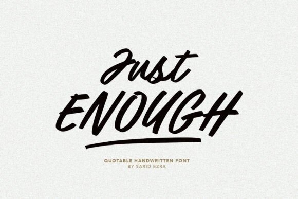
A
g
R
&
f
Q
![Free font preview]()
![Free font preview]()
![Free font preview]()
Type It. Preview It.
Your Brand
Your Brand
Your Brand
✦ 100% Free Fonts
Type It. Preview It.
Wear It.
Type your own words, drop them onto real mockups, and download your design in seconds. Free OTF, TTF, SVG and PNG.
80,000+Free Fonts
SVGExclusive Downloads
7Categories
Category:
All
Serif
Sans Serif
Blackletter
Slab Serif
Script
Display
Symbol
Browse all fonts by category
Script Fonts
Serif Fonts
Sans Serif Fonts
Display Fonts
Blackletter Fonts
Slab Serif Fonts
Symbol Fonts