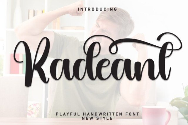
Radeant feels like a confident handwritten note, where each stroke flows with a graceful ease that hints at modern sophistication while retaining a whimsical charm. The letterforms are fluid yet controlled, with subtle swashes and rounded terminals that give the typeface a warm, approachable personality. Its balanced contrast and smooth curves make it feel both refined and playful, perfect for designs that need a personal touch without losing polish. Overall, Radeant exudes confidence, creativity, and a touch of nostalgia, inviting viewers to linger a little longer on the message. This script shines in branding projects such as boutique logos, artisanal packaging, and bespoke invitations where a handcrafted feel is essential. It also works beautifully on editorial spreads, social‑media graphics, and wedding stationery, adding a sense of intimacy and elegance. The font’s generous x‑height and legible spacing ensure readability even at smaller sizes, while its decorative alternates allow for customized flair. Designers can mix Radeant with clean sans‑serifs or classic serifs to create striking visual hierarchies that stand out in any medium.
Perfect for: Wedding Fonts